
Your church website doesn’t need to win a design award. It needs to do one thing: make a first-time visitor feel like your church is worth showing up to on Sunday.
That sounds simple. But if you’ve ever stared at a blank page in a website builder, cursor blinking, wondering what font to pick or where the menu should go or whether your homepage needs a slideshow, you know it doesn’t feel simple. It feels like you need a degree you don’t have.
Here’s the good news. You don’t need a designer. You don’t need a creative eye. You don’t need to understand color theory or typography or anything that sounds like an art school elective. You need three principles and the willingness to apply them. That’s what this guide is about.
Everything in this post is written for the person who got handed the church website because nobody else would do it. The pastor who’s building it at 10pm after the kids are asleep. The admin who’s been meaning to update it for six months. The volunteer who said “I can figure it out” and is now realizing that was optimistic.
You can do this. Let’s walk through it.
Why Church Website Design Is Different From Regular Website Design
Most website design advice is written for businesses selling products. Add a hero banner. Include social proof. Create urgency. Optimize for conversions.
Some of that applies to churches. Most of it doesn’t. Your church isn’t selling shoes. Your church is inviting a stranger into a community, and that requires a completely different approach to design.
A church website has one primary audience: the person who has never been to your church. They found you on Google, or a friend sent them a link, or they drove past your building and got curious. They’re on their phone. They have about 10 seconds of patience. And they’re making a decision based almost entirely on how your site makes them feel.
That feeling isn’t about flashy graphics or trendy layouts. It’s about clarity, warmth, and trust. Does this site tell me what I need to know? Does it feel like real people are behind it? Does it look like someone cares? They may not be asking those specific questions, but that is what they are feeling whether they know it or not.
If you can achieve those three things, your design is working. If you can’t, no amount of polish will fix it.

The Three Design Principles That Replace Design Talent
Here’s the system. Three principles. Every decision you make about your church website should run through these three filters. If it passes all three, it’s a good design decision. If it doesn’t, change it.
Principle 1: Hierarchy. Guide the Eye.
Hierarchy is a fancy word for a simple idea: the most important thing should be the most obvious thing.
When someone lands on your homepage, their eyes need to go somewhere first. Not everywhere. Somewhere. If everything on the page is the same size, the same weight, the same color, nothing stands out. The visitor’s brain goes “I don’t know what to look at” and they leave.
Here’s how to apply this without any design training.
Make your headline the biggest text on the page. Not your church logo. Not your menu. Your headline. Something like “A church in Springfield that feels like family” or “Join us this Sunday at 10am.” That’s the first thing they should read, followed by a plan your visit button.
Service times or campus choosing (if campuses have different times) should be visible without scrolling. This is the single most common piece of information visitors are looking for. If they have to hunt for it, your hierarchy is broken.
One primary call to action. Not five buttons in different colors. One big, obvious button that says “Plan Your Visit” or “Join Us Sunday.” Everything else is secondary. When you give people too many choices, they choose none. We usually opt for two calls to action. A Plan Your Visit and some type of ‘Get Connected’ option as well.
Use size to signal importance. Headlines are big. Subheadings are medium. Body text is smaller. This sounds obvious, but look at a lot of church websites and you’ll see paragraphs of the same-sized text with no visual breaks. It’s exhausting to read, so nobody reads it.
Think of it like a Sunday morning announcement. If your pastor stood up and said 14 things at the same volume with no pauses, nobody would remember any of them. It’s like reading in monotone. But if he said one thing clearly and then paused, everyone would remember it. That’s hierarchy.
Principle 2: Breathing Room. Let It Rest.
The second principle is whitespace, which designers also call negative space. It’s the empty space around and between elements on your page.
Most non-designers are afraid of whitespace. It feels like wasted space. Like you’re not using the page efficiently. Like you should fill it with something.
That instinct is wrong. Whitespace is not wasted space. It’s what makes everything else readable and attractive.
Here’s the difference. Imagine a church bulletin that’s crammed edge-to-edge with text, announcements, clip art, and a tiny font because Nancy tried to fit everything on one page. Now imagine a bulletin with three things on it, clearly laid out, with room to breathe. Which one do you actually read?
Your website works the same way. When you give your content room to breathe, people can actually process it. When you cram things together, everything competes and nothing wins.
Put more space between sections than you think you need. If it feels like too much space, it’s probably right. Your instinct will tell you to close the gaps. Resist it.
Don’t fill every section of your page with content just because the section exists. If your website template has six homepage sections, that doesn’t mean you need to use all six. Three well-done sections beat six cluttered ones.
Limit how much text you put in any single section. If a paragraph is longer than four lines on a phone screen, break it up. Short paragraphs are easier to read. Walls of text get skipped.
Use images as breathing room too. A beautiful photo of your church between two text sections gives the eye a rest and makes the page feel warm instead of overwhelming.
Principle 3: Consistency. Pick a Lane and Stay In It.
The third principle is the one that separates amateur-looking websites from professional-looking ones, and it has nothing to do with talent. It’s about consistency.
Consistency means making the same design choices everywhere. Same fonts. Same colors. Same button styles. Same spacing. When everything matches, the site feels intentional and trustworthy. When things don’t match, it feels chaotic, even if the visitor can’t articulate why.
Here’s what this looks like in practice.
Pick two fonts. Maximum. One for headings, one for body text. Use them everywhere. The moment you introduce a third font (or, worse, use a different font on every page), the site starts looking like a ransom note.
Pick two or three colors. Your primary color (probably from your church logo), one accent color, and white or off-white for backgrounds. Use those colors for buttons, headings, and accents. Do not use every color your website builder offers.
Make all your buttons look the same. If your “Plan Your Visit” button is a rounded blue rectangle, every button on the site should be a rounded blue rectangle. Not some square, some rounded, some blue, some green, some outlined, some filled. Same style everywhere.
Use the same photo style. If your homepage has warm, candid photos of real people, don’t suddenly switch to clip art or stock photos on your About page. The visual language should feel like the same church across every page.
Consistency is like a dress code. Nobody notices when everyone’s dressed appropriately. But if the pastor is in a suit, the worship leader is in a Hawaiian shirt, and the usher is in pajamas, it’s distracting. Same idea with your website. Match the tone across every page.
The Five Design Mistakes Churches Make Most Often
Now that you have the three principles, let’s talk about the mistakes that violate them. These are the things I see on church websites more than any others, and every one of them is fixable in an afternoon.
Mistake 1: The Slideshow That Nobody Watches
If your homepage has a rotating image carousel with five or six slides, here’s the truth: almost nobody sees anything past the first one. Studies on web behavior have shown this for years. Users don’t wait for slide three. They scroll past.
Worse, slideshows slow your page down. Each slide is an image that has to load. On a phone with a mediocre connection, that carousel is adding seconds to your load time, and every second costs you visitors.
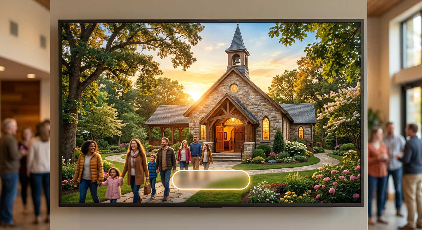
The fix: replace your slideshow with one strong image and one clear headline. That image should show real people at your real church. That headline should tell a visitor what they need to know. One strong message beats five weak ones.
Mistake 2: Stock Photos Everywhere
Speaking of images. If your church website is full of stock photos of ethnically diverse people in business casual sitting in a pristine pew with perfect lighting, visitors notice. Not consciously. But something feels off. It doesn’t look like a real church. It looks like an advertisement for a church.
The fix: use real photos of your actual church. They don’t need to be professional quality. A decent smartphone photo of your worship team, your kids area, your lobby on a Sunday morning, or your building from the parking lot is worth ten times more than a Getty Images download. Authenticity beats polish. Every single time.
If you don’t have good photos, take some this Sunday. Ask someone with a decent phone camera to snap candid shots during the service. Bright, natural lighting. Real smiles. Real moments. That’s all you need.
Mistake 3: Too Many Menu Items
Here’s a rule of thumb: if your navigation menu has more than six or seven items, you have too many. Your visitor doesn’t need to see every page on your site from the menu. They need to see the important pages.
A good church website navigation looks something like: Home (which is just linked via the logo, everyone knows that), About, Plan Your Visit, Sermons, Events, Give. That’s six items. That covers everything a first-time visitor needs. Everything else, your staff page, your small groups directory, your missions page, can live under sub-menus or be linked from within other pages.
When your menu has 12 items, the visitor’s brain does the same thing it does when the page has no hierarchy: it freezes. Too many options. No clear path. They leave.
Mistake 4: Walls of Text With No Visual Breaks
Church leaders love words (preachers, ya know?). That’s not a criticism. Ministry is built on communication. But what works from a pulpit doesn’t always work on a screen.
If your About page is eight paragraphs of dense history and theologically focused text with no headings, no images, and no visual breaks, almost nobody will read it. They’ll skim the first two lines and move on. On a phone, that wall of text is even more overwhelming.
The fix: break up your content with headings, short paragraphs, and images. Use a heading for every new idea. Keep paragraphs to three or four sentences. Drop in a photo or a pull quote between sections. Give the reader’s eyes somewhere to rest. Think of it as preaching with pauses.
Mistake 5: Ignoring Mobile Completely
More than half of your website visitors are on a phone. For many churches, it’s closer to 70%. If you’ve only ever looked at your website on a desktop computer, you have no idea what your visitors are actually seeing.
Buttons that are too small to tap. Text that requires pinching and zooming. Images that bleed off the edge of the screen. Menus that don’t open properly. These aren’t minor issues. They’re the reason people bounce from your website after a few seconds.
The fix: pull out your phone right now and load your church website. Actually use it. Try to find your service times. Try to fill out a form. Try to watch a sermon. If any of those feel frustrating, your mobile experience needs work. Google also uses mobile experience as a ranking factor, so a bad mobile experience really hurts your search visibility too.
Choosing Fonts and Colors (Without Overthinking It)
This is where most non-designers spiral. The font menu has 489 options. The color picker has infinite shades. How do you choose?
Here’s the shortcut.
Fonts: Use a clean sans-serif font for body text. Something like Inter, Open Sans, Lato, or Montserrat. These are all readable, modern, and free because they are google fonts. For headings, you can use the same font in bold, or pick one slightly more distinctive font that pairs well. If you’re not sure what pairs well, just use the same font family for everything. Nobody will think your website sucks because you used one font. They will definitely think it sucks if you used seven.
Need some inspo? I like using https://www.fontpair.co as a starting point for font combos.
Colors: Start with your church logo. Pull the primary color from that. If your logo is blue, your site uses blue as the primary accent color, for buttons, headings, and links. Add white or off-white for backgrounds. Add a dark gray (not black) for body text. That’s your palette. If you want an accent color, pick one that contrasts well. Blue primary? Try a warm orange or gold accent. Green primary? Try a deep navy accent. Keep it to three colors total.
If your church doesn’t have established brand colors, pick one color that feels warm and inviting. Earth tones, soft blues, forest greens. Avoid neon anything. Avoid pure black backgrounds. Avoid red as a primary color (it reads as aggressive on screen).
I like playing around with coolors.co palette generator. Typically I’d add the primary color we are messing with and use the generator to get a background color, secondary color, dark color and light color (oftentimes the dark color is the same as my primary color and the light color is the same as the background color or just a shade or two darker).
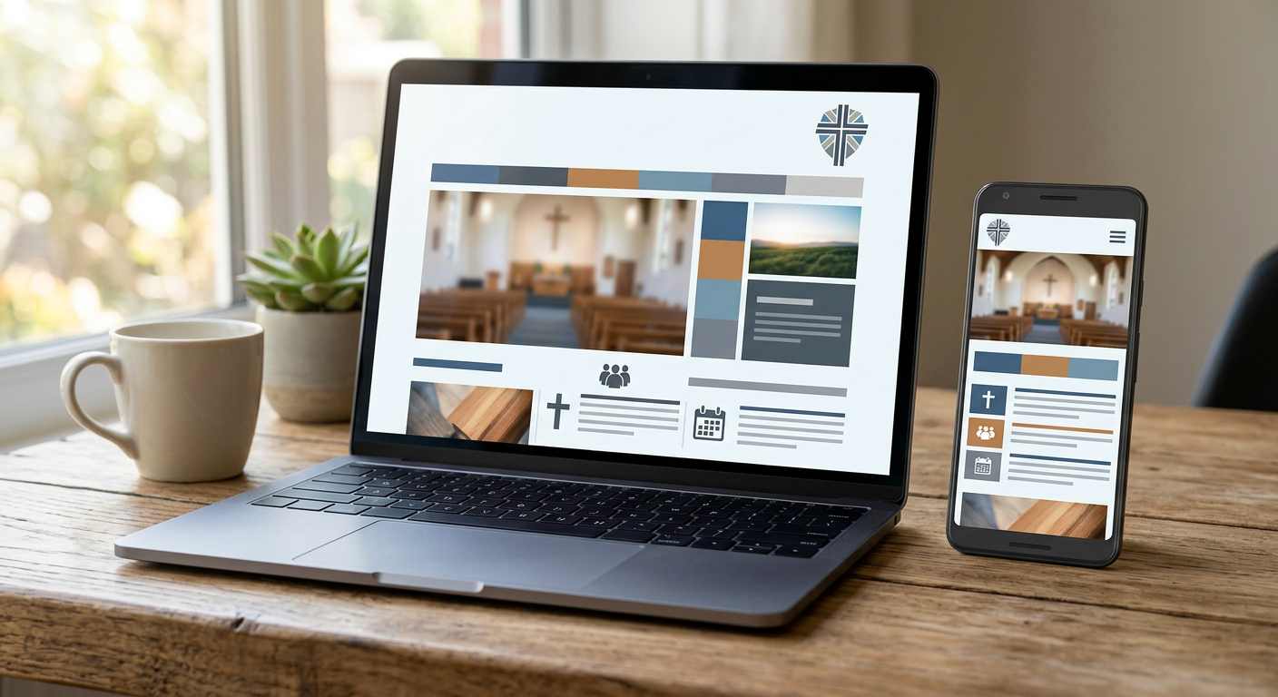
The Homepage Layout That Works for Every Church
If you’re starting from scratch and want a homepage that works without any design talent, here’s the layout. It follows all three principles and covers everything a first-time visitor needs.
Section 1: Hero. One background image (real photo of your church). One headline. Service times displayed clearly. One button: Plan Your Visit. That’s the entire top of the page.
Section 2: What to Expect. Two or three sentences about what a Sunday morning looks like. Casual dress, welcoming people, relevant teaching, great kids programming. Keep it short and honest.
Section 3: A Warm Image Break. A wide photo of your congregation, your worship team, or your kids area. No text needed. Just a moment of visual warmth.
Section 4: Featured Content. Your latest sermon, an upcoming event, or a quick intro video from the pastor. One piece of featured content, not three.
Section 5: Footer. Address, phone number, service times again, links to your social media, and your church brief mission statement. Keep it clean.
That’s five sections. It follows hierarchy (headline first, CTA obvious), breathing room (image break, short text), and consistency (same fonts, same colors, same photo style throughout).
When to Use Photos, When to Use Graphics, and When to Use Nothing
A quick guide for the visual decisions that trip up non-designers.
Use photos when you want to show what your church is really like. Sunday mornings, community events, kids laughing, the pastor greeting someone at the door. Real moments build trust.
Use simple graphics when you need to explain something visual, like a map to your building, a timeline for an event, or a comparison chart. Keep graphics clean and minimal. If you’re making them yourself, use a tool like Canva and stick to one template style.
Use nothing (meaning whitespace) when the content speaks for itself. Your About page doesn’t need a graphic for every paragraph. Your service times don’t need a decorative border. Sometimes the best design decision is to let the text breathe.
Your Website Design Doesn’t Have to Be Hard
Here’s the truth that nobody in the web design industry wants to admit: most of what makes a website look good isn’t creativity. It’s discipline. It’s following a small number of principles consistently across every page.
Hierarchy. Breathing room. Consistency. That’s 90% of good design. The other 10% is having content that actually serves your visitor, and you already know how to do that because you do it every Sunday morning.
The churches that struggle most with their website are the ones trying to do too much. Too many pages, too many fonts, too many colors, too many competing messages. The fix is almost always to simplify. Take things away until what’s left is clear.
If you want to skip the design decisions entirely, that’s exactly what FaithMade is built for. Every FaithMade site is Move-In Ready, meaning the layout, fonts, colors, and page structure are already set up for churches before you touch anything. Leo, our AI assistant, generates your content based on your church’s name, location, and style. You get a church website that looks like a designer built it, without making a single design decision. Easy peasy.
Your church deserves a website that looks like someone cares. Because someone does. You do. You just needed a system, not a design degree.
Start your FaithMade site and see what Move-In Ready looks like for your church.
