
Most church websites have a homepage, a staff page, and a "Contact Us" form that nobody fills out. That's not a website. That's a digital bulletin board, and nobody reads bulletin boards.
Here's the thing. Your church website only needs about 7 pages. That's it. But what goes on those pages matters far more than having them at all. A homepage that says "Welcome to Grace Community Church" and nothing else is doing more harm than not having a homepage, because it tells a visitor you don't care about their experience.
This is the page-by-page breakdown of what your church website actually needs, what goes on each page, and what you can skip entirely.
The One Rule That Changes Everything: Think Like a Visitor
Before we get into the pages, here's the lens that should guide every decision you make on your website.
You are not your audience. Your church staff knows where the building is. They know what Wednesday night looks like. They know Pastor Mike's last name. A first-time visitor knows none of that.
Every page on your church website should answer one question: what does a stranger need to know? Not what does your congregation already know. Not what your deacons think should be on the site. What does a person who has never set foot in your building need in order to feel comfortable showing up on Sunday?
That's the filter. Run every page through it. If the content doesn't serve the person who's never been, it doesn't belong on the main navigation.
The 7 Pages Every Church Website Needs
Here's the list. No fluff, no "nice to haves." These are the pages that actually move someone from curious to connected.
1. Homepage
This is the page that does the most heavy lifting on your entire site. A visitor will spend about 5 seconds deciding whether your church feels like a place they'd want to visit. Five seconds.
What belongs here:
- A clear headline that says what your church is and where you are. "A church in Springfield, MO that feels like family" works. "Welcome to our website" does not.
- Service times and location, visible without scrolling. This is the number one thing visitors are looking for. Don't bury it.
- A Plan Your Visit button. Big. Obvious. Above the fold. This is the single most important action on your entire website.
- A quick sense of what to expect. One or two sentences. "Expect casual dress, real conversations, and coffee that's actually good." People want to know the vibe before they walk in.
- A few real photos. Not stock photos. Real people at your real church. Authenticity beats polish every time.
What doesn't belong here: your full mission statement, a letter from the pastor, a calendar of every event this month, or a rotating slideshow of 14 images that nobody watches past the second one.
2. About Page
This is your second most visited page. People click "About" because they want to know who you are and whether they'll fit in.
What belongs here:
- Your story in 2-3 paragraphs. How your church started, what you're about, what matters to you. Keep it warm. Keep it honest.
- Your beliefs, stated simply. You don't need a 40-point doctrinal statement on this page. Link to one if you have it. But give people the essentials: what do you believe, and how does that show up on a Sunday?
- Photos of real life at your church. Worship, small groups, community events, kids laughing. Show the experience, not just the building.
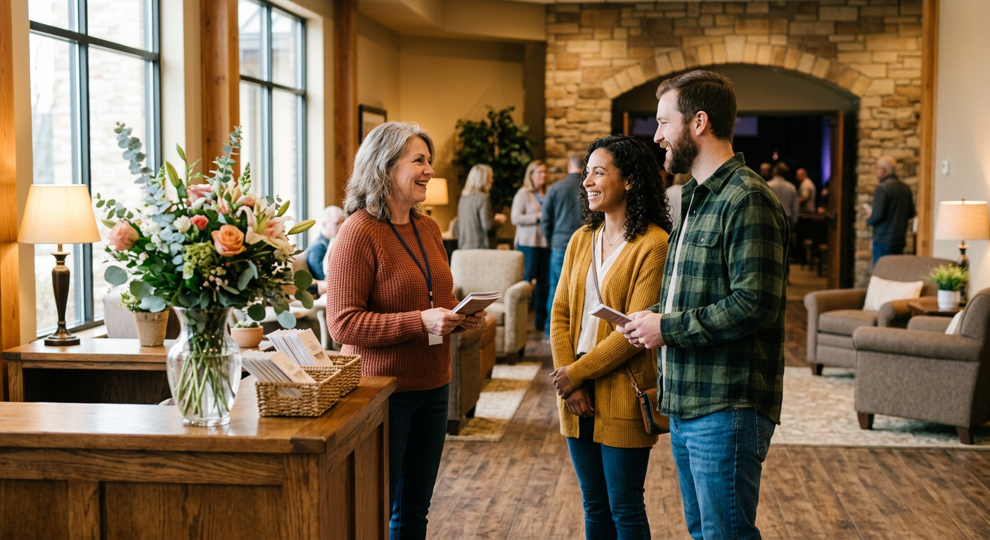
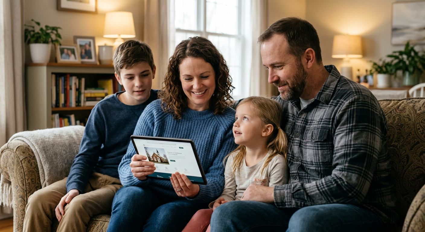
3. Plan Your Visit Page
This is the page that turns a curious browser into someone who actually shows up on Sunday. If your church doesn't have a dedicated Plan Your Visit page, this is the single highest-impact thing you can add today.
What belongs here:
- Exactly what to expect. What time to arrive. Where to park. What the dress code is (spoiler: there probably isn't one, but say that). Where to go when they walk in. Whether there's coffee.
- A short form. Name, email, maybe "how many people are coming?" and "do you have kids?" That's it. Every extra field is friction. Keep it short.
- What happens after they submit. Tell them: "We'll send you a quick email with everything you need to know before Sunday." Then actually send that email.
- A personal touch. A photo of your welcome team. A short video from the pastor saying "We're glad you're coming." Something that makes it feel like a person is on the other end.
This page is your church's digital handshake. Make it warm.
4. Sermons Page
People visit your sermons page for two reasons. First-time visitors want to preview your teaching style before they commit to a Sunday. Regular attenders want to rewatch or share a message that meant something to them.
What belongs here:
- Your most recent sermon front and center. Video or audio, with a clear title and date.
- A searchable archive organized by series, topic, or date. Make it easy to browse.
- Share buttons. Your congregation is your best marketing team. Make it one tap to share a sermon link.
What doesn't belong here: sermons from 2014 that were recorded on a phone in a gymnasium. Quality matters. If your older recordings are rough, start your archive from when the quality got good enough.
5. Ministries or Groups Page
This is where a visitor goes after they've decided your church seems worth trying. They want to know: is there something here for me beyond Sunday morning?
What belongs here:
- A clear list of your ministries and groups. Kids ministry, youth group, small groups, men's and women's groups, volunteer teams, whatever you offer.
- A one-sentence description of each. Who it's for, when it meets, what to expect.
- A way to sign up or learn more. A button, a form, a contact person. Don't just list the group and leave people wondering how to join.
Keep it simple. You don't need a separate page for every ministry. One well-organized page with clear sections works better than 15 thin pages that each say three sentences.
6. Events Page
Your church probably has things happening beyond Sunday services. This is where those go.
What belongs here:
- Upcoming events with dates, times, and locations. Sounds obvious. You'd be surprised how many church event pages are missing one of these three.
- A brief description of each event. Who it's for, what it is, whether they need to register.
- Registration or RSVP links where applicable. If someone needs to sign up, make the button right there.
One important note: keep this page current. An events page with a Vacation Bible School listing from last summer tells visitors nobody is maintaining this site. If you can't keep it updated, remove the page entirely and just mention events on your homepage.
7. Contact Page
Simple. But most churches get it wrong by making it a dead-end form that goes into an inbox nobody checks.
What belongs here:
- Your physical address with an embedded map. Make it clickable so it opens in their navigation app.
- A phone number that someone answers. If nobody answers the church phone during the week, say that and provide an alternative.
- Office hours. When can someone actually reach a human?
- A contact form that goes to a real person who responds within 24 hours. If you can't commit to that, put an email address instead.
The Page You Think You Need (But Probably Don't)
Staff page. Hear me out.
Most church staff pages are a grid of headshots with names and titles. They serve the existing congregation ("oh, that's who handles missions") but they do almost nothing for a first-time visitor. A visitor doesn't know these people yet. A grid of faces with titles like "Associate Pastor of Discipleship" doesn't help them decide whether to visit.
If you want to include a staff page, that's fine. But don't put it in your main navigation (most of our starter sites have them on the about page). It's not one of the 7 pages a visitor needs. Put it under your About page or in the footer. Spend that main navigation slot on something that actually helps a stranger take the next step.
Your Website Doesn't Need More Pages. It Needs the Right Pages.
Most church websites have too many pages that say too little. Seven well-built pages will outperform thirty thin ones every single time.
Start with your Plan Your Visit page if you don't have one. Update your homepage if it still says "Welcome to our website." Cut the pages nobody clicks on. Put the visitor first, and your website starts working the way it should.
FaithMade builds every one of these pages into your site from day one. Move-In Ready means your homepage, Plan Your Visit page, sermons, events, groups, and contact page are all structured for visitors before you type a single word. Easy peasy.
